Monday, April 18, 2005

Blog Experience!

Talk of color psychology, and a wonderfully immersive environment that is created by
http://glish.com/css/blogger/blogger.html comes to our notice.

It is a wonderful experience. You are reading a post about something that could make you angry, with a red background and theme. Sometime later the matter remains, but the raging red tones, change to a mellow soothing blue. You keep switching through posts to find a soothing continuity of color theme blends, which leaves you with mixed emotions and fluctuating perceptions.

All in all, a wonderful Loungeish effect, where you see things in more than one way it was meant.

Wednesday, April 13, 2005

The Citi never types?

Hmmm... The Good and the Bad of the new CitiKeypad

This is a wonderful attempt by the Citibank Guys, and it also stirring mixed feelings about itself.
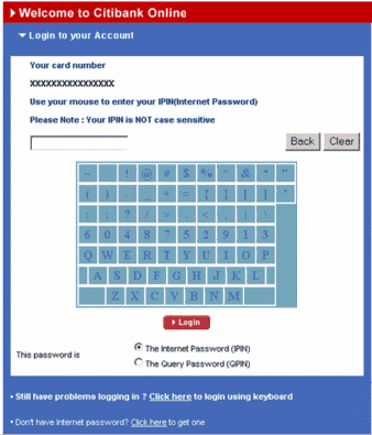
Let's call it the CitiKeyPad!

Well, there are some things that are Good! And other things that are bad! Just like every other thing around...and soon things will be refined and evolve towards perfection.

What's Good about CitiKeyPad?

1. With the rise of Spyware programs and other trojans and keyloggers, you are saved of the threat of your keystrokes being trapped.

2. The KeyPad has a way of refreshing itself into several permutations over time, and so is as unpredictable for an onlooker.

3. The low contrast in the background and foreground color makes it tough to identify from a distance what was being clicked.


What's bad (like almost everything else, nobody's perfect) about CitiKeyPad?

1. The low contrast is tough for the user to figure out the letters.

2. The proximity of the letter tiles is a tremendous usability problem. You don't know if you clicked S or D.

3. Midway through, your phone rings and you lose track of where you were. Can I undo? Start from scratch?


It definitely is a precocious and thoughtful attempt towards security, but pondering certain design and User Experience issues should bring about a wonderful progress.


Monday, April 04, 2005

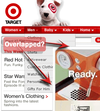
OverLapped!

Hopped on to Target and was bowled over by the branding, and the Look and Feel.

Slick! And you have a crisp and young feel throughout the site.

This site has something you can call a Website Blooper!
The Flash cruelly overlaps the menu, and blinds the User!

The Flash in the centre-right just cruelly overlaps the DHTML menus. And the user keeps wondering what's under the wraps...

Ah well, but kudos to the guys who did the identity system and Emotional(Doggie, wag, wag) Design!

The warm and earthy colours definitely make you want to feel cozy, with a cup of Coffee...